After visiting the first two issues of Joe Kelly’s run, let’s head back to 1963’s Amazing Spider-Man #2 by Marvel creators and legends Stan Lee and Steve Ditko!
Writer: Steve Ditko, Stan Lee
Penciller: Steve Ditko
Solicitation: The First Appearance of the Vulture! The Vulture’s rampage in Manhattan begins. Can Spidey take down the avian menace?
Published: May 1, 1963
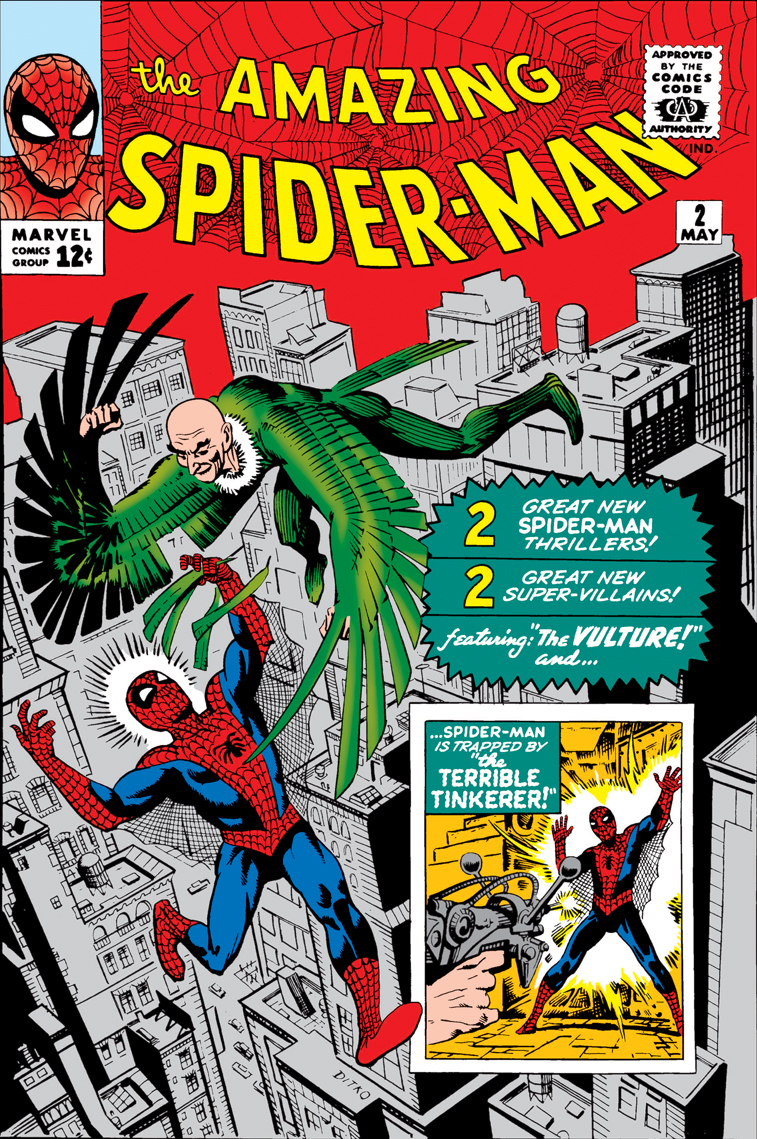
First, the cover for this issue seems campy and nostalgia-pulling, even for the relatively new pop culture phenomenon that Spider-Man was in 1963. I do appreciate the cameo appearances of the comic book’s villains (Vulture and The Tinkerer) on the front page, which serve to inform prospective buyers of the story inside while also providing collectable display value.. I marvel at the fact that this issue cost twelve cents in the Spring of 1963, but prospective facsimile reprints in this era would be sold for roughly five dollars. While perhaps not as iconic a cover as the first issue, we still see the great world-building arrangement of Ditko, with the New York City skyline a mere arrangement of clean pencil strokes and light color.

After reviewing the first two issues of Amazing Spider-Man (2025), it is interesting to revisit Peter Parker’s high school origins. Like many teenagers, Peter is quite money-hungry. Unlike most teenagers, he has the means to make some serious dough! In the abstract, I can relate. The frequently overlooked students at my high school tended to have cash in their pockets. However, nobody at my high school received superhuman strength from a radioactive spider. Shame. In the same panel, the teacher’s attire shows its age, alongside a lack of safety equipment and procedures in a chemistry lab that would horrify a 21st-century education administrator.

find it interesting to notice how far our nation’s obsession with winning the atomic and space races has come. The shifting— no, the progressing of American popular culture’s affinity to the cutting-edge would take Peter Parker out of the chemistry lab and plant him at Parker Industries, Stark Industries, or another blue chip corporation on Earth-616. Capitalism sucks, even in the Spider-Verse.
The line work on these early issues is truly irreverent in comparison to the modern art. Color feels special to the spectacle without drowning the reader’s eye in detailed line work and inking. It is key to note the pulpy newspaper style of earlier generations. Today’s comics are printed on glossier magazine paper. Thus, it is fair to say that technology is not the only reason for the gradual transition away from Ditko’s style. I am enjoying the High School Era of Stan Lee’s run, and I will happily give this issue a READ rating.
Rating: READ