To provide more detail, Is have decided to continue legacy comic reviews in bundles of issues, today with issues #3 through #6 in Stan Lee and Steve Ditko’s Amazing Spider-Man run. As each issue is essentially just a chapter, it feels incomplete and unfair to judge unfinished sequential storytelling on its own. Also, these vintage Silver Age issues are most likely to be read digitally or in a compilation rather than acquired as a single issue from your friendly local comic shop. But first, let us review the covers.

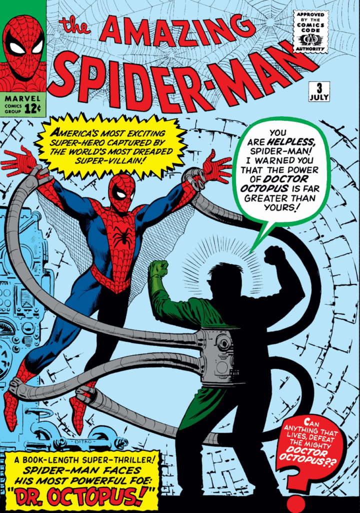
The third issue features a familiar foe to fans of the MCU: Dr. Octopus! Here in his first appearance, the cover shows a full costume shot of Spider-Man gripped by Doc Oct’s claws, albeit in an awkward pose from the artist. His outfit is quite “dweebish” in comparison to Alfred Molina’s fashionista interpretation in Spider-Man: No Way Home. I dislike this cover because it lacks dynamism, but I appreciate its scenic battle functioning as an advertisement for the story within. A quirk that is mostly lost from modern comic book covers. In 1963, Marvel was still fighting tooth and nail for market share among a large crowd of competitors. Today, Marvel and DC dominate the American comics industry.

The fourth issue features another one of Spider-Man’s classic foes: the Sandman! The cover artist makes an interesting decision to take the concept of the cover as a synopsis-advert, with an additional three panels of action on the cover. The problem of dynamism has been addressed since the previous cover. Unfortunately, the quadrant panel art cover distracts from a singular focus, sabotaging the presentation, especially given that the panels are close variations of combat posturing between the protagonist and Sandman against a mundane backdrop.

The fifth issue cover features another well-known supervillain, but not in their first appearance. Dr. Doom is a familiar face to Spider-Man, being a dastardly foe of the Fantastic Four and an established force in the nascent Age of Marvel. This cover is more appealing than the previous two, inspired by the dynamism of issue #4 with the single cover panel of issue #3. Therefore, issue #5 is my “Goldilocks” option. The background and title also pop with contrast in several shades of vibrant colors, leaning into the fantastical.

Issue #6 is the final cover I will be discussing today, and it follows the successful formula of the previous book. Spider-Man finds himself stuck between a rock and a hard place as the Lizard bears down on him in a vertical crawl space. Interesting to notice for the first time is the declaration “The Marvel Age of Comics is here!”. I can only imagine this as the beginning of an advertisement campaign for the connected Marvel universe. This functions as a creative use of the free space on their publications to be displayed on newsstands. 62 years later, we are still discussing it, so the creative and/or editorial team was probably right! This cover lacks texture and variety in the scenery, which would have benefited from a more detailed touch.

In the third issue, Spider-Man’s battle against Dr. Octopus follows his wish for more worthy opponents, leading to Spider-Man’s first defeat! In the following issues, we can see that Peter’s confidence has grown, as he uses his skills to fight crime and assist at the Daily Bugle. However, his defeat at the hands of Dr. Octopus leaves our hero confronting his shortcomings in a crisis of confidence, aggravated by the need to go about his day as Peter Parker. In real life, it would likely be difficult to feel sympathy for a masked vigilante’s struggles to maintain a healthy lifestyle. But Peter Parker exists in the Age of Marvel, where superheroes are somehow raised above the status of ordinary people to protect society from supervillains that the traditional authorities are unequipped to deal with. In reality, the courage to do the right thing in service of others makes heroes, but superheroes should not exist because they operate outside of the rule of law. Battles between superhuman combatants with varying interpretations of right could destabilize society while discouraging more socially beneficial alternatives to vigilante justice. Alternatives that could reduce crime, improve social well-being, and protect the common good without involving the destruction of life and property. However, the often campy attitude typical of early Marvel provides antagonists with antisocial or malicious motivations, making support for Spider-Man against the “bad guys” quite chic.
At this point in our hero’s beginning, he has developed a sizable tea party of rivals to hone his Spidey skills against. Even in 1963, Peter Parker had a mob of criminals trying to take him down. But when you are the friendly neighborhood web-head, it’s fair to have some jealous fans. I enjoyed all of these books, but my favorite of the bundle was issue #5 featuring Dr. Doom. The Latverian dictator is one of my favorite Marvel antagonists. The writing for all of these issues is quite verbose, and I think Stan Lee could have allowed his artist to express their interpretations of the script more and write-in less. The writing in issue #3 feels campy without charm, while the art in issue #4 felt quite constrained and unimaginative compared to Ditko’s proven ability to illustrate. The sixth issue was a welcome change of pace in the art, featuring new locales requiring non-congruent line work common of Ditko’s interpretation of the New York City skyline.
Rating: #3, 5, 6: READ
#4: PASS